


please send a mail
-->here<--
Power Spectral Density computation (Spectral Analysis)
MicroJob Package Deal Service PD001A/B(Copyright Cygnus Research International (Apr 20, 2015))
Page 3 of PD001A/B User Guide
Table of Content
(1) Summary of PD001A/B
(1-1) What this Package Deal service, PD001A does
(1-2) What PD001B does
(1-3) Summary of selectable computational parameters
(1-3-1) Detrending data (Applicable to all cases)
(1-3-2) Confidence interval percentage (Applicable to all cases)
(1-3-3) Taper ratio of Tukey window (Applicable to cases B1, B2 and B3 only)
(1-3-4) FDS bin-width (Applicable to all cases except for cases A1, B1 and C1)
(1-4) Computational procedure
(1-5) Your Data (Input data)
(1-6) Products
(1-6-1) Data file (Product file)
(1-6-2) Graphs (Figures) in PDF (PD001A only)
(1-7) Price and ordering procedure
(1-8) Confidentiality
(2) Detail of the product
(2-1) Product files
(2-1-1) Format of Product file
(2-1-2) Explanation of contents of product files
(2-1-2-1) Frequency
(2-1-2-2) Period
(2-1-2-3) PSD
(2-1-2-4) Confidence interval of PSD
(2-1-2-5) Percent of variance
(2-1-2-6) Amplitude (Amplitude spectrum)
(2-1-2-7) Phase
(2-1-3) How to use/interpret data in our product file
(2-1-3-1) Drawing graphs
(2-1-3-2) PSD and Confidence interval of PSD
(2-1-3-3) Estimating amplitude of variations at specific frequencies using amplitude spectrum
(Case 1) When the signal is a sinusoid and the amplitude of it is constant or almost constant in time
(Case 2) When the signal itself is not a sinusoid but the composition of sinusoids of various frequencies
(Case 3) When the signal is sinusoid but the amplitude of the signal varies in time
(Case 3-1) Variation of amplitude itself is sinusoidal
(Example 1) Amplitude of sinusoidal oscillation of frequency f0 varies sinusoidally. Frequency of amplitude variation is f1 and f1 is smaller than f0. Both f0 and f1 are constants.
(Example 2) Amplitude of sinusoidal oscillation of frequency f0 is summation of a constant and a sinusoidal variation of frequency f1.
(Case3-2) Amplitude of sinusoidal oscillation of frequency f0 varies but that variation does not resemble to a sinusoid.
(Case4) When the signal is periodic but the signal does not look like a sinusoid
(2-1-3-4) Obtain some idea how strong the variations within a specific frequency range are.
(2-1-3-5) Construct digitally filtered time series data
(2-1-3-6) Alternative method of amplitude estimation
(2-2) Graph
(3) How to prepare data for this package
(4) Guide for setting proper selectable parameters
(4-1) Detrending and removing average; Yes or No? Default setting is Yes.
(4-1-1) What is detrending? Why do we have to do that?
(4-1-2) Example of detrending
(4-1-3) When detrending becomes harmful
(4-2) Taper ratio of Tukey window; 0~100(%) Default setting is 10%
(4-2-1) Why we need to apply a window function
(4-2-2) What does window function do
(4-2-3) Why Hanning window is not necessarily a good solution
(4-2-4) Why we provide non-windowed and Tukey windowed result for PD001A
(4-2-5) The method to reduce dumping near the both ends of data while still using Hanning window
(4-2-6) Implicit FDS
(4-2-7) Implicit FD'Smoothing' Really?
(4-2-8) Reduction of PSD and amplitude due to the window
(4-2-9) Does correction of reduction of PSD work well?
(4-2-10) Tukey window; how taper ratio affects its characteristics
(4-3) Bin-width of FDS; 1,3,5,7,... (Odd integer); Default setting is None, 3 and 7
(4-3-1) FDS works well for PSD
(4-3-2) FDS does NOT work well for amplitude spectrum
(4-3-3) Frequency resolution when we applied FDS
(4-3-4) Alternative method of FDS
(4-4) Percentage of confidence interval; any positive value larger than 0.0 and smaller than 100.0; Default is 95.0
Appendix 1; About numerical error generated by computers.
Appendix 2; Spectral leakage of power spectrum density function and window functions.
Appendix 3; Why we see a single peak instead of twin-peaks when data length is short.
Appendix 4; How the frequency of S1 affects the detectability of SR
(Case 2) When the signal itself is not a sinusoid but the composition of sinusoids of various frequencies
In this case our signal will be decomposed into several different frequency components of sinusoids (please see equation (3)).
(Case 3) When the signal is sinusoid but the amplitude of the signal varies in time
We described in (2-1-2-6) that amplitudes Am in equation (3) must be constant in time. Then, the question here is what would happen when amplitude of signal varies in time.
(Case 3-1) Variation of amplitude itself is sinusoidal
(Example 1) Amplitude of sinusoidal oscillation of frequency f0 varies sinusoidally. Frequency of amplitude variation is f1 and f1 is smaller than f0. Both f0 and f1 are constants.
Conclusion first. If our data is long enough we will not see a peak either at f0 or at f1. Instead, we will see peaks at f0+f1 and at f0-f1. (If f0 is smaller than f1 second peak will be at f1-f0.) Amplitudes of these two peaks are the same. In the following, we assume f0 is larger than f1.
Figure 2-11(a) shows an example of time series of this case. S (bottom), our test data here, is S0 (middle) multiplied by S1 (top). The horizontal positions of mountaintops of S agree those of S0 (in phase) between 0.0 and 0.5 but the horizontal positions of mountaintops of S agree the horizontal positions of valley bottoms of S0 (out of phase) between 0.5 and 1.0. This is because value of S1 is positive between 0.0 and 0.5 but it becomes negative between 0.5 and 1.0.
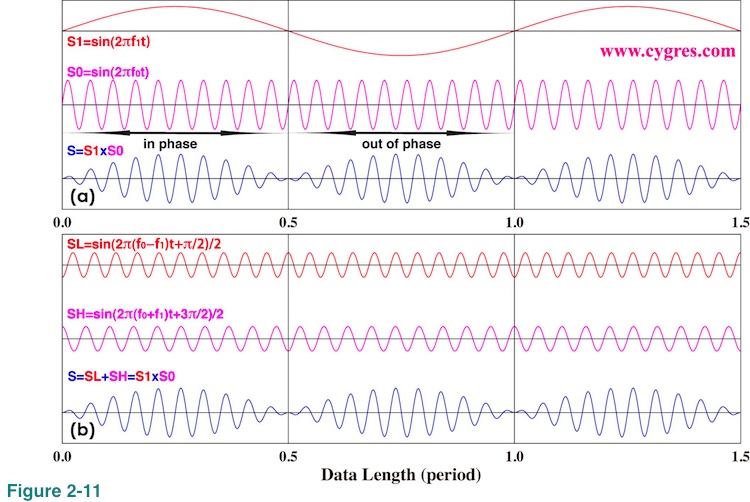
Whatever the phase relation is, we still think there is a variation of frequency f0 everywhere by looking at S in Figure 2-11(a) (blue line at the bottom). However, PSD computation does not see it that way if time series is long enough. The reason of this is as follows.
B in equation (4) is a constant and we set it to 1.0 in Figure 2-11. P0 and P1 are phases (please see Figure 1-2 for phase) and we set both of them to zero in Figure 2-11 for the sake of simplicity.What equation (4) shows is that our signal is actually equal to a composite of two equal constant amplitude (B/2) sinusoids (SL and SH) but of different frequencies. The important point here is that the amplitudes of both SL and SH are constant in time and that is why we see peaks of these sinusoids if we draw a graph of PSD. Am in equation (3) must be constant as we described before.
SL (top) and SH(middle) in Figure 2-11(b) are these two components in the third line of equation (4). Adding these two together produces S (bottom) and this S is the same as S in Figure 2-11(a). Although SL and SH in Figure 2-11(b) look the same except that they are out of phase, if we count number of mountains or valleys we can see that frequencies of these two are different. Thus, correct amplitude spectrum and PSD show there are two peaks at f2=f0-f1 and at f3=f0+f1, and the amplitudes of those are identical. We also like to mention that the first line of this equation (blue underline) shows that it would not make any difference if we swap f0 and f1 as long as we also swap P0 and P1 at the same time.
How long should data be to see this thing happen? We will show actual computational results next, but first let us explain it verbally. Assuming we have data shown in Figure 2-11, if we increase data length little by little, initially we will only see a single peak at f0. Amplitudes at frequencies other than f0 start increasing as we add more data, but none of them becomes outstanding and this will continue until data length reaches to a half of the period of S1 (horizontal position is 0.5). When data length is 0.5, S becomes the same as S0 multiplied by a window function called Cosine window. When data length is very short, frequency resolution may be too large to separate a signal at f0+f1 from the one at f0-f1. We will start seeing twin-peaks instead of a single peak as data length becomes closer to one period of S1 (1.0 in Figure 2-11). When data length is equal to one period of S1 we will get twin-peaks and amplitudes of them are 0.5. As we add more data, we will see twin peaks most of the time but may see a single peak occasionally. In general we will see only twin-peaks if data length is more than a few times of period of S1. For the mathematical explanation of this behavior, please see Appendix 3. As of the accuracy of amplitude computation, the conclusion is that we will get best result when frequencies of both peaks match the frequency of PSD.
Figure 2-12(a) shows time series of test data S in this case. You may have noticed that S in Figure 2-12(a) looks different from S in Figure 2-11 but this is because we set both P0 and P1 (phase; equation (4)) to non-zero values this time. The unit of horizontal axis of Figure 2-12(d) is the period of S1. Actual data starts from 0 but the computational result using data shorter than 1.0 (one period of S1) is quite confusing and thus we omit that part in this graph as before.
Now let us call the bin, frequency coverage of which includes f0-f1 (lower frequency), signal bin1 and the bin, frequency coverage of which includes f0+f1 (higher frequency), signal bin2. Figure 2-12(b) shows amplitudes of signal bin 1 (blue) and signal bin 2 (red). We did not detrend data and did not apply any window function for these computations. Vertical blue and red dashed lines show where frequencies of the signal bins agree with their respective actual signal frequencies (f0-f1 and f0+f1). As we mentioned before we cannot choose arbitrary frequencies for PSD computation. In these particular computations frequency of signal bin 1 always matches f0-f1 when frequency of signal bin 2 matches f0+f1. Thus, all of the red dashed lines are drawn over blue dashed lines. The horizontal solid black line shows actual signal amplitudes, 0.5. This graph shows that adding more data would not improve accuracy of computed amplitude greatly if we already have more than a several period of S1 as in the case of Figure 2-4(b). We are well aware that this graph is too complicated to see the details and we will show another graph next for closer inspection.
Figure 2-12(c) shows phases of signal bins. The unit of this graph is 1 pi radian (Thus, the maximum is +1.0 and the minimum is -1.0). Horizontal blue and red solid lines show the phases of actual signals. We will show another graph for closer inspection next. Figure 2-12(d) shows frequency bandwidth of bins. We omit the results when we applied Tukey and Hanning window to save a space.
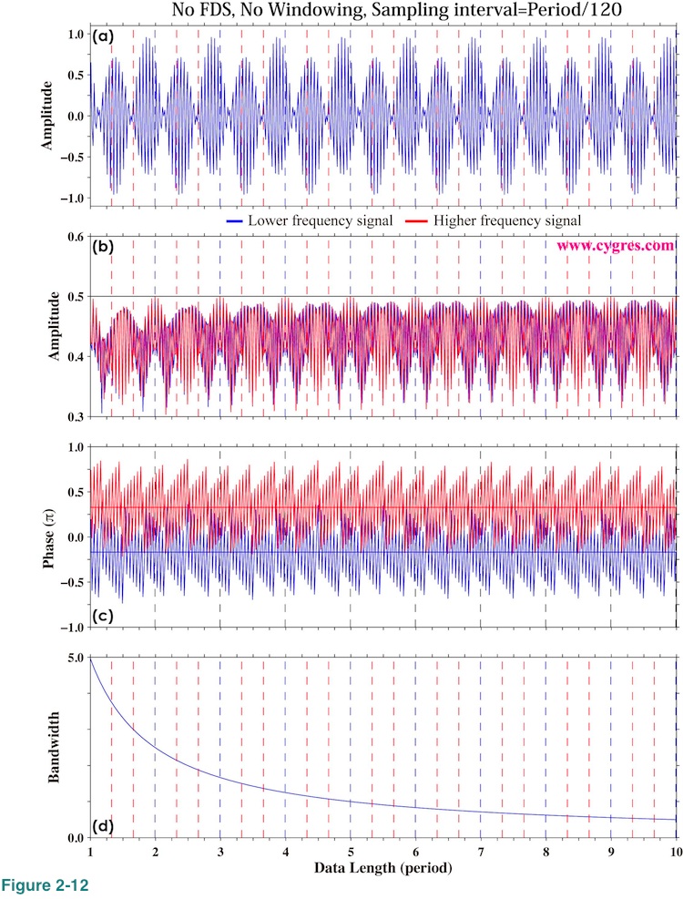
Figure 2-13 shows expanded view of amplitudes and phases of signal bins for the data length between 7.8 and 8.8. Here we show the results when we applied Tukey and Hanning window as well. These graphs show that the amplitudes of signal bins vary quite rapidly unlike those shown in Figure 2-4(b) but this is because the periods of twin-peaks are much shorter (frequencies are higher) than the period of S1. If we use an average period of twin-peaks, which is equal to the period of S0 (Figure 2-11(a)), as a unit for horizontal axis instead of period of S1 and expand horizontal axis accordingly, we will see slow variations similar to those shown in Figure 2-4(b). This graph shows that it is very important to pay attention to periods of twin-peaks to get the best amplitude and phase estimates.
The vertical short solid blue line A indicates the data length where frequencies of both signal bin 1 and signal bin 2 agree with their respective signal frequencies. This data length is also the data length when the end point of data can be connected smoothly to the start point of the data and an application of a window function is not necessary as we will explain in (4-2-1). The amplitudes and phases of both signal bins are very close to actual signal amplitudes and phases.
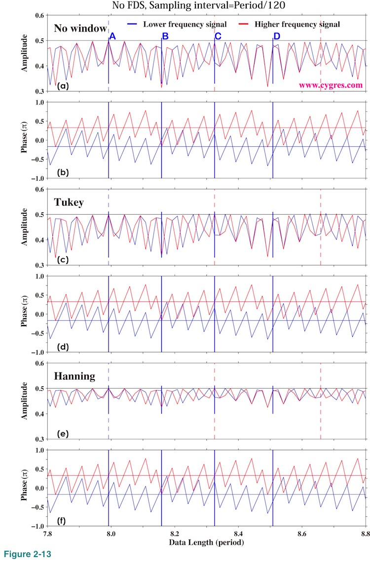
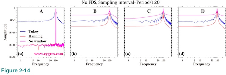
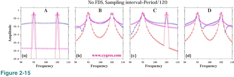
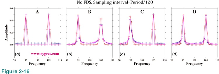
Figure 2-14(a) shows amplitude spectra when data length is A. This graph shows that the amplitude spectra have sharp twin-peaks. This is clearer in Figure 2-15(a), which shows expanded view of amplitude spectra around twin-peaks. When we applied Tukey window (blue line), amplitude spectrum has relatively large values at frequencies other than signal frequencies. When we applied Hanning window (red line), peaks become wider (3 points) due to the implicit FDS. These features are pretty much the same as those shown in Figure 2-5 and Figure 2-8 except that now we have twin-peaks instead of a single peak. Figure 2-16(a) is basically the same graph as Figure 2-15(a) except that we used a linear scaling so that it will be easier to read amplitudes of peaks. This graph shows that the amplitudes at frequencies other than signal frequencies are actually much smaller than the signal bin amplitudes despite the impression one may get from Figure 2-15.
The vertical short solid blue line C in Figure 2-13 indicates the data length when only the frequency of signal bin 2 agree with signal frequency. When data length is C, Figure 2-15(c) and Figure 2-16(c) show that the higher frequency peak (signal bin 2) is sharper and the amplitude of it is closer to the actual signal amplitude, while the lower frequency peak is wider and its amplitude is ovbiously less than the actual signal amplitude. The vertical short solid blue line B in Figure 2-13 is located at the middle point between A and C and the frequency of signal bin 1 is relatively close to the actual signal frequency. Figure 2-16(b) shows that the amplitude of signal bin 1 is relatively close to the actual signal amplitude when data length is B. The vertical short solid blue line D is located at the middle point between C and another point where only the frequency of signal bin 2 agrees with actual signal frequency. When data length is D, the frequency differences between signal bins and their respective actual signals are almost the same. Figure 2-16(d) shows that both peaks are wider.
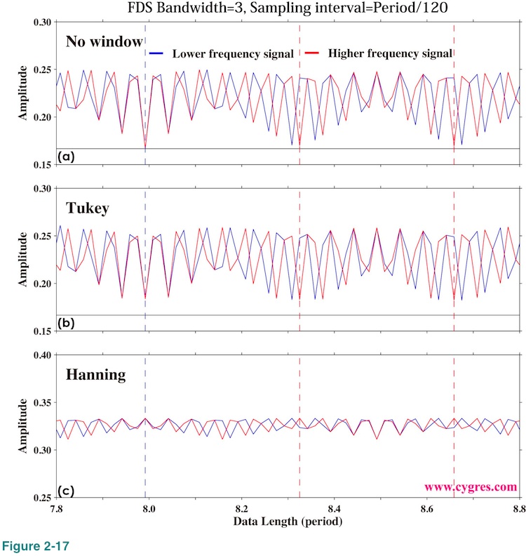
The effect of FDS is the same as before (Figure 2-10). Therefore we only show the graph similar to Figure 2-10(a) below. Again, FDS is not that helpful for amplitude spectrum.
Finally, if we subtract f0 from frequencies of all the bins (that would allow negative frequencies) and draw a graph of PSD using these modified frequencies, we will get two-sided PSD of S1. The appearance of this new PSD is the same as that of PSD without frequency modification except for horizontal axis labels (frequencies).
(Example 2) Amplitude of sinusoidal oscillation of frequency f0 is summation of a constant and a sinusoidal variation of frequency f1.
The signal of this case is expressed as
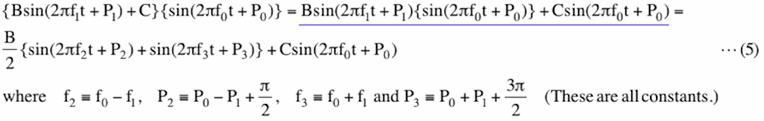
Here, all of the coefficients in equation (5) (B, C, f0, f1,f2,f3, P0,P1,P2 and P3) are constants. The right hand side in the upper line of equation (5) (blue underline) is equal to the right hand side of equation (4) plus a sinusoidal variation of frequency f0. Thus, amplitude spectrum and PSD show peaks at three frequencies in this case. The peak at f0, amplitude of which is C, is located right in the middle of two other peaks at f2=f0-f1(or f1-f0 if f0 is smaller than f1) and f3=f0+f1. The amplitudes of other two peaks are B/2. This case is more like an AM (Amplitude Modulation) radio signal. AM radio wave is a constant frequency sinusoidal wave (carrier wave), amplitude of which varies with (modulated by) music or voices. If equation (5) represents an AM radio signal and we tune to f0, we will hear a single monotonous tone, frequency of which is f1. We cannot distinguish tone at f0+f1 from the one at f0-f1 because their frequencies are equally distanced from f0.
(Case3-2) Amplitude of sinusoidal oscillation of frequency f0 varies but that variation does not resemble to a sinusoid.
In this case variation of amplitude of a signal, D(t), itself might be expressed as summation of sinusoids of various frequencies. Then, this case is just an extension of a previous case and
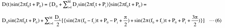
Here, all of the coefficients (Di, fi and Pi, including the case when i=0) in equation (6) are constants. What above equation shows is that there will be a peak at f0 and M other pared peaks centered at f0. We will show an example of this case in (2-1-3-5) where we added some noises. Again, if we subtract f0 from frequencies of all the bins and draw a graph of PSD using these modified frequencies, we will get two-sided PSD of D(t). Using AM radio wave analogy, this means that we will get two-sided PSD of music and voices on AM radio by simply modifying horizontal axis of original PSD.
(Case4) When the signal is periodic but the signal does not look like a sinusoid
Even in this case signal will be decomposed into sinusoids of multiple frequencies so that equation (3) will be satisfied. There will be multiple peaks in PSD and amplitude spectrum. The frequency of the signal is usually the frequency of the peak of the lowest frequency in PSD and amplitude spectrum. We show several examples in ->Figure 2 of this page<-. We did not apply any window function but we applied a 3-bin FDS and the frequency match was achieved for all of those examples.
(2-1-3-4) Obtain some idea how strong the variations within a specific frequency range are.
Let us assume we want to demonstrate variations within a specific frequency range are important. One of the ways to do this is presenting variance of variations within that specific frequency range relative to the total variance because that would show the amount of "energy" within that specific frequency range relative to the total amount of "energy". Variance is the statistical quantity, which is often considered to be related to "power" or "energy" of variations as we described in (2-1-2-5). We can accomplish our task simply by selecting rows of our product file by referring frequency column (first column) first and then compute sum of percent of variance (6, 12, 16, 20, 25, 29, 33, 38 or 42nd column; Table 2A) within that selected rows.
(2-1-3-5) Construct digitally filtered time series data
It is possible to construct digitally filtered time series data using equation (3) with the information of amplitude (Am in equation (3)) and phase (Sm) we provide. The first step is determining frequency or period range we want to keep. Then, select bin numbers by referring frequency or period (column 1 or 2 of our product file). Finally, construct filtered time series data using equation (3) but only with those selected bins. In this section, we use results of PSD computation to which a window function is not applied. If we use results of PSD computation to which a window function is applied, equation (3) would only reproduce deformed data; data after a window function is applied.
Figure 2-18(a) shows the results when we applied a high pass filter (HPF), a band pass filter (BPF) and a low pass filter (LPF) to the data shown in Figure 1-1(a) as an example. (HPF is a filter that removes low frequency components. LPF is a filter that removes high frequency components. BPF is a filter that removes both high and low frequency components.) The shortest period (upper frequency limit of HPF) we can get is 2 hours and this is determined by sampling interval as we described before. The longest period, which is determined by data length, is 1250 days and that is the lower frequency limit of LPF. We also draw original time series data at the bottom (red) for comparison. This is basically the same as Figure 1-1(a). Low pass filtered data reproduces smoothed shape of original data well in this case.
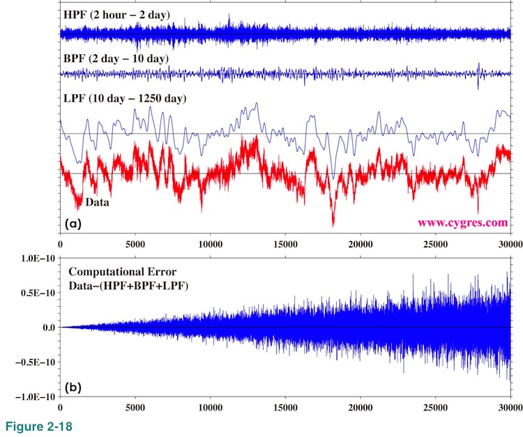
Since the summation of the frequency ranges of HPF, BPF and LPF contains entire frequency range, summation of these three filtered time series is supposed to be equal to original time series data. Figure 2-18(b) shows the difference between original time series data and the summation of these three filtered time series data. This graph shows small computational error we described before. The maximum value of original time series data exceeds 100 and the standard deviation is about 31.9. Therefore, these errors are much smaller (order of 1E-12 or one trillion times smaller) than original data and negligible for majority of applications but this is another example that the result of computation like this does always contain some small computational errors. Another thing to be noted here is that this filter cannot remove effect of spectral leakage.
As an extension of above, we might be able to use information of amplitudes and phases to construct signal from noise-contaminated data. We start our demonstration when noise is relatively small. Our first test data is similar to the case 3-2 in (2-1-3-3) and
![]()
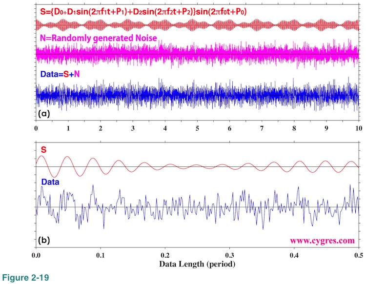
Here D0=0.8, D1=0.4, D2=0.3, f0=100, f1=4, f2=10 and all of these are constants. P0, P1 and P2 are also non-zero constants. We omit unit of any of these constants here because units are not important for our demonstration. We generated "Noise" using a random number generator. The standard deviation of generated noise is about 1.0 and this means strength of noise is about the same as that of the signal we want to detect. The signal part of this data includes variations at 5 frequencies. Namely,
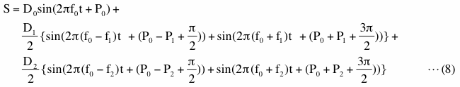
Figure 2-19(a) shows time series of signal (S), noise (N) and the data (S+N). We can see that the amplitude of N is comparable to the amplitude of S. The unit of horizontal axis is the period of sinusoidal variation of f1 (=1/f1). Figure 2-19(b) shows expanded view of S and data. It might be difficult to see S in the data, but if you try to locate positions of mountains and valleys, you will see that S does exist in the data.
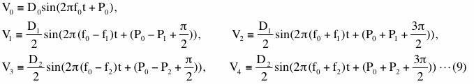
Let us defineV0, V1, V2, V3 and V4 as
With these variables, equation (7) can be simply expressed as
![]()
Now let us call the bin, which includes V0, signal bin 0, the bin, which includes V1, signal bin1 and so on. Figure 2-20 shows amplitudes and phases of these signal bins. We detrended data this time for these computations. The unit of horizontal axis written at the bottom of Figure 2-20(d) is period of f1 (=1/f1). We omit initial one period as before. The actual amplitudes of V1 and V2 are the same (please see equation (9)) and shown as a horizontal solid black line in Figure 2-20(a). The actual phases of V1 and V2 are different and they are shown as blue and red horizontal solid lines in Figure 2-20(b). Figures 2-20(c) and (d) are the same as figures 2-20(a) and (b) but for V3 and V4. These graphs are complicated but they show that the results of computations become relatively steady at far right. We picked up three data lengths indicated by vertical solid blue lines labeled A, B and C to show more detail. We omit V0, which corresponds to a 'carrier wave' in case of an AM radio signal, in this graph to save a space.
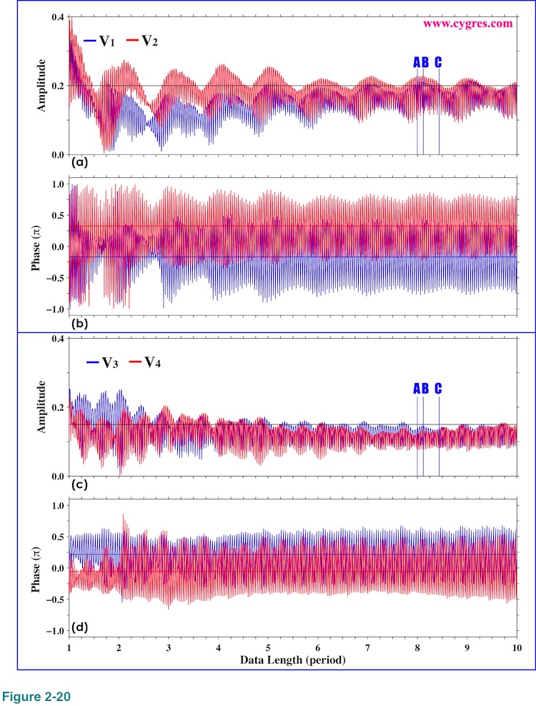
Figure 2-21 shows the expanded view of variations of amplitudes and phases of signal bins near A, B and C. Although A is the data length when frequencies of all of the signal bins match their respective signal frequencies, figures 2-21(a) and (c) show that the amplitudes of these signal bins are close to but are not exactly equal to actual signal amplitudes unlike the case shown in Figure 2-13. This is due to the noise we added. B is the data length when none of frequencies of signal bins matches their respective signal frequencies and C is the data length when frequencies of signal bin 3 and signal bin 4 are relatively close to their respective signal frequencies.
Figure 2-22 shows amplitude spectra of test data (blue) and of signals (red; S in equation (8)) for data length A, B and C. No window function was applied for these computations. These graphs show that the spectrum of noise is fairly flat across the entire frequency range. When data length is A, end point and start point of data without noise (red) can be connected smoothly and thus Figure 2-22(a) shows that the amplitudes at frequencies other than the signal frequencies are zero within computational accuracy as in the case shown in Figure 2-5(a). It must be stressed here that it will be very difficult to achieve complete frequency match when we have signals of multiple frequencies. We chose signal frequencies very carefully for this test to achieve this condition. When data length is not A, we have spectral leakage and that raises spectrum across entire frequency range as before. Figures 2-22(b) and 2-22(c) show that the effect of spectral leakage at frequencies far from signals is much smaller than the effect of noise in this example and is not detectable when we add noise, however.
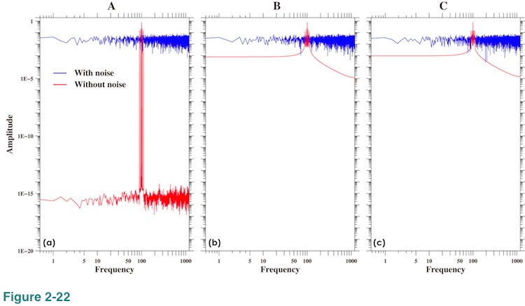
Figure 2-23 shows expanded view of amplitude spectra of signals (noiseless; corresponding to red line in Figure 2-22(a)) around signal frequencies. For these graphs we used linear scaling and the plus (+) marks in these graphs show the frequency and the amplitude of bins. The heights of short horizontal black solid lines (5 lines for each) indicate actual signal amplitudes and the central positions of these lines indicate actual signal frequencies. Please note that they do not necessarily match frequencies of signal bins. When data length is A, Figure 2-23(a) shows that amplitudes of signal bins are practically equal to actual signal amplitudes and all the peaks are single point sharp peaks. When data length is not A, figures 2-23(b) and (c) show that amplitudes of signal bins deviate from actual signal amplitudes and some peaks become wider.
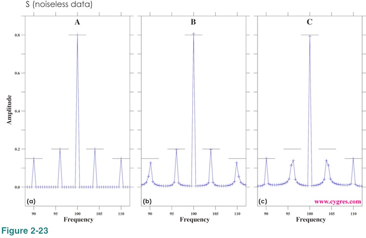
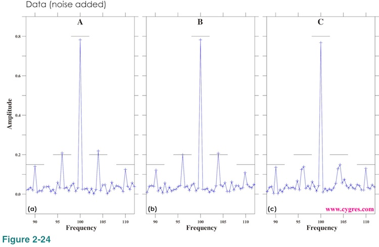
Figure 2-24 shows how amplitude spectra change if we add noise. Although noise in this case is large enough to obscure signals in Figure 2-19, peaks in amplitude spectra are easily identifiable.
There seems to be several strategies to reproduce signals from noise-contaminated data. The first one is picking up only the signal bins and then using equation (3). We call this Method 1. This method will underestimate signal amplitude when frequencies of signal bins do not match actual signal frequencies. The other strategy is picking up signal bins and two neighboring bins up and down (or left and right in Figure 2-23 and 2-24) and then using equation (3). In other words, pick up three bins for each signal. We call this Method 2.
Figure 2-25 shows time series of actual signal (S in equation (8) and Figure 2-19) at the top, reproduced signal (S' for abbreviation) by Method 1 using amplitude spectra of noiseless data for data length A, B and C (red lines in figures 2-22 (a), (b) and (c)) and their differences from S (=S-S') below. The data lengths where amplitude spectra are computed are shown as vertical black solid lines. The standard deviation of difference between S and S' when data length is A is about 2.2E-5 and this difference is too small to be seen in Figure 2-25(c). The differences between S and S' when data length is B and C are still small but they are large enough to be seen in figures 2-25(e) and (g). These differences are symmetrical with the minimum in the middle of the section left of vertical black lines (not in the middle of graph). Differences tend to increase at the far right, which suggests extrapolation is a bad idea as usual. The point we would like to make here is that if frequency does not match, signal reproduction will not be perfect even if the data contains only the signal but nothing else.
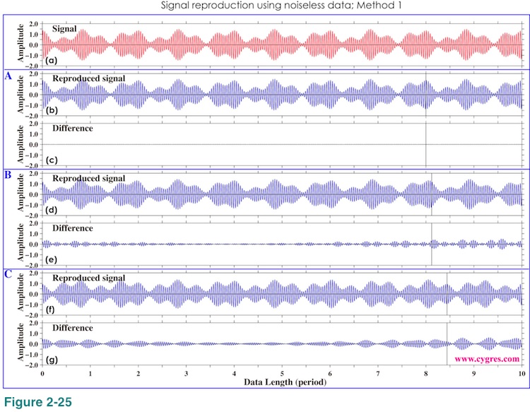
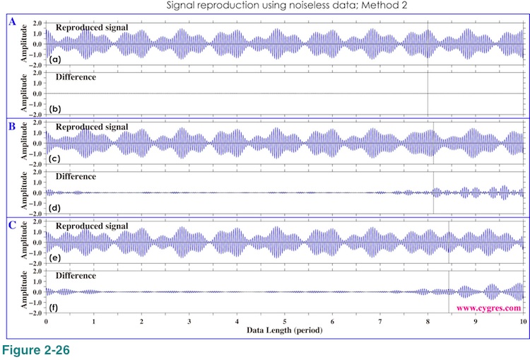
Figure 2-26 shows S' by the Method 2 and their differences from S. Figures 2-26(d) and (e) show that the differences between S and S' decrease slightly than those by Method 1. If we add more bins, S' will eventually become almost identical to S since we only have S but nothing else in this case.
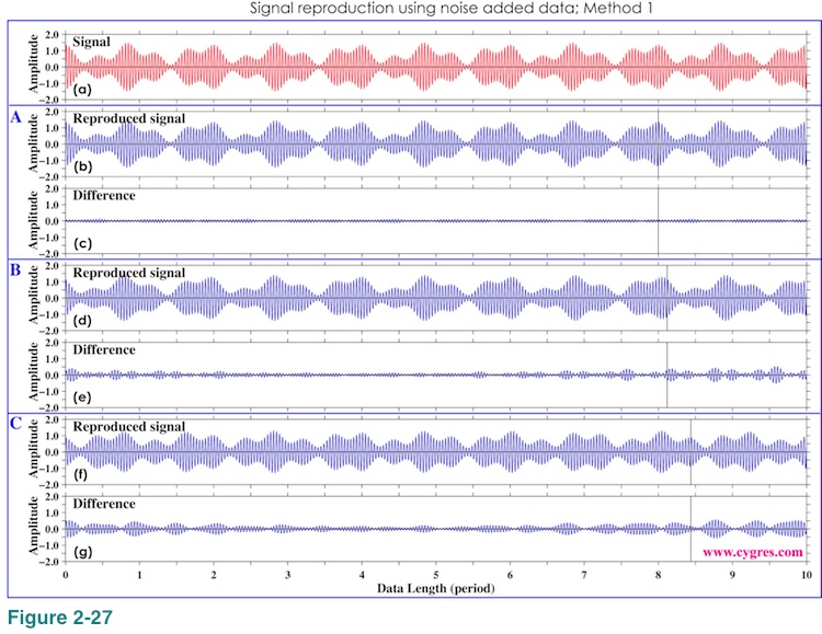
Graphs of Figure 2-27 are the same as those of Figure 2-25 (Method 1) except that these are the results of noise added data (Data in Figure 2-19(a)). The differencs between S and S' become larger.
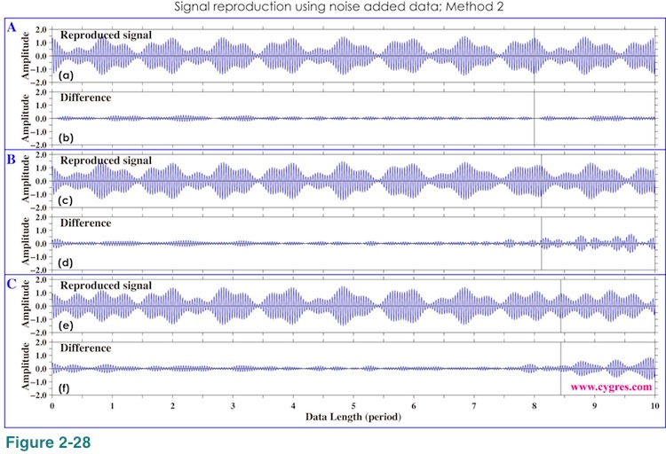
If we use Method 2 to reproduce S from noise added data, Figure 2-28 shows that the differences slightly decrease as before. However, unlike the case of noiseless data, adding more bins will make difference between S and S' larger at a certain point because we are using noise added data here.
To read next page, please click right button below.

